NYC subway math
Apparently MTA (the company running the NYC subway) has a real-time API. My fascination for the subway takes autistic proportions and so obviously I had to analyze some of the data. The documentation is somewhat terrible, but here’s some relevant code for how to use the API:
from google.transit import gtfs_realtime_pb2
import urllib

for feed_id in [1, 2, 11]:
    feed = gtfs_realtime_pb2.FeedMessage()
    response = urllib.urlopen('http://datamine.mta.info/mta_esi.php?key=%s&feed_id=%d' % (os.environ['MTA_KEY'], feed_id))
    feed.ParseFromString(response.read())
    print feed
I started tracking all subway trains one day and completely forgot about it. Several weeks later I had a 3GB large data dump full of all the arrivals for 1, 2, 3, 4, 5, 6, L, SI and GC (the latter two being Staten Island railway and Grand Central Shuttle).
Let’s do some cool stuff with this data!
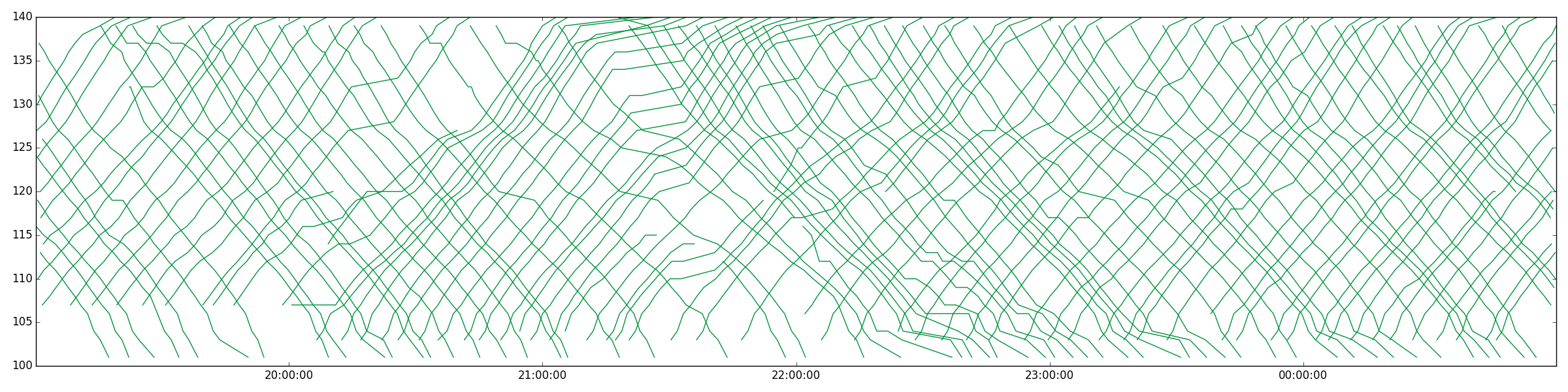
For instance, here are a bunch of subway trains for a while on the 1 line:
The reason I started looking at this data was to understand if to what extent waiting for a subway is “sunk cost” vs. an investment. In particular, what is the optimal strategy if you’re waiting for the subway? My intuition told me that there’s a T such that the expected additional time you have to wait goes down as you approach T, but then goes up afterwards. Until T, every second you wait gets you closer to the next subway. After T, there’s most likely some random issue with the subway and you should just give up.
Turns out there is such a thing. But let’s start by just looking at a plot of subway delays. The distribution of time between two trains $$ P(t) $$ looks like this:
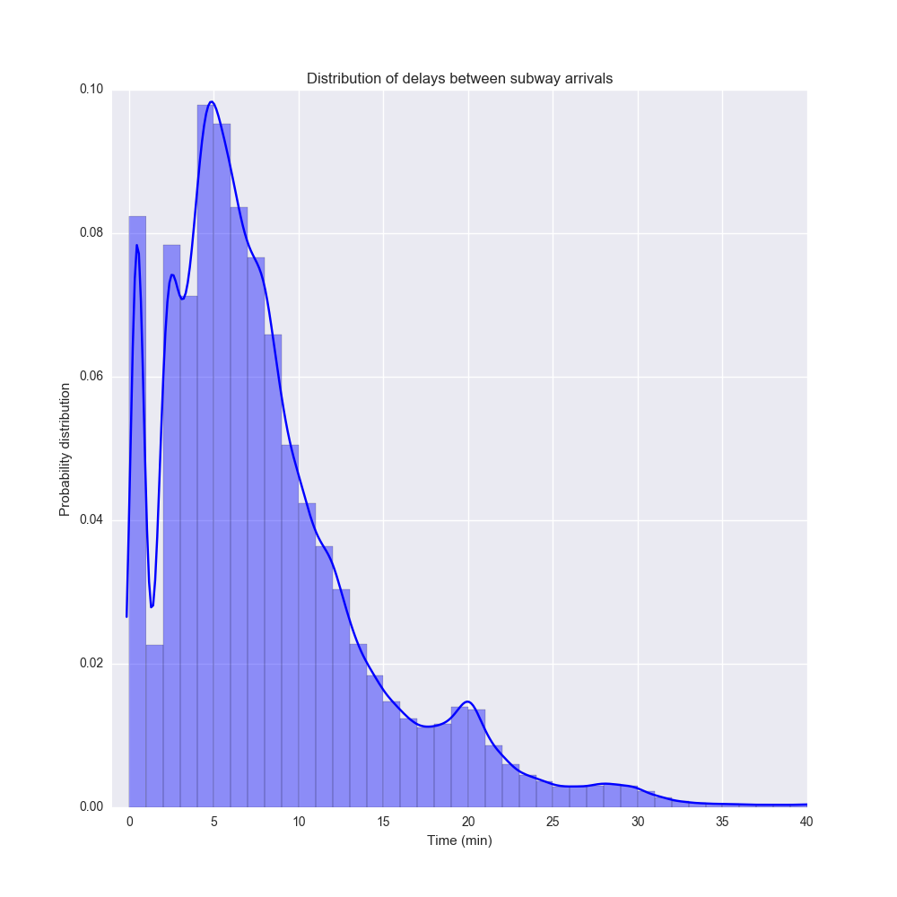
This a probability distribution made from the distplot function in Seaborn. It’s a histogram (with 1 minute bins) combined with a kernel density estimation of the probability distribution.
An interesting thing is that the distribution is multimodal with the biggest peak around 5 minutes and another around 20 minutes. I suspect this reflect rush hour vs night traffic. There’s also a peak just after 0 which I suspect is just what happens during rush our traffic when subways end up clustering.
Note that this is not the distributions of waiting times, which is a bit different. If you assume that you are equally likely to arrive at any subway stop at any time of day, then the waiting time until the next subway looks like the distribution below. This represents a probability distribution where at any time of day, you pick a subway line, go to a random subway station, and wait for the next train.
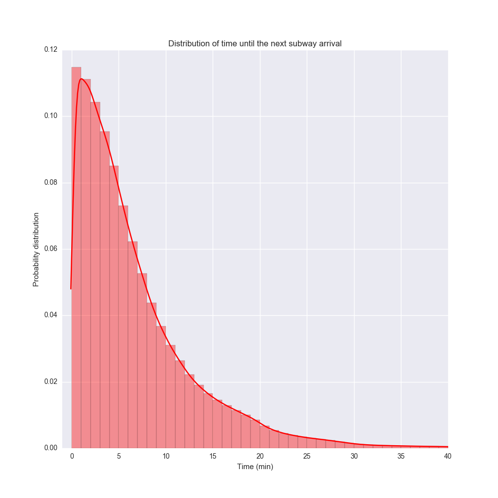
This distribution is a bit more regular. The most likely time you have to wait (the mode) is actually about 1 minute, although the mean and the median are much larger.
Erik please digress and talk about the relationship between the two curves
Complete side note, but I realized in general you can take the distribution of time between events $$ P(t) $$ and can convert to the distribution of time to the next event using the relation
$$ Q(t) = \frac{ \int_t^\infty P(s) ds }{ \int_0^\infty sP(s) ds } $$
My math is a bit rusty so please don’t use this for heart surgery. But it seems to work – if you plug in a Dirac delta $$ P(t) = \delta(t-d) $$ then you get the uniform distribution back: $$ Q(t) = 1/d, 0 \le t \le d$$. In the data above I just implemented it in a dumb way by sampling.
Waiting time by line
Let’s plot the average time to arrival by line. This is limited to the lines in the API. Let’s switch to a violin plot using Seaborn.
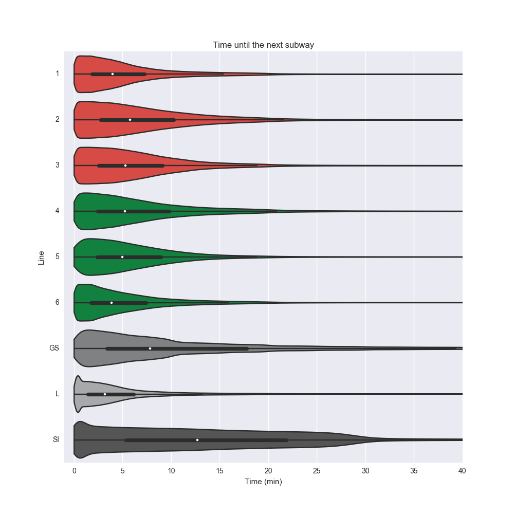
Interestingly, L stacks up pretty well against the other subway lines, despite its notorious delays (and websites such as is the L train fucked). The median waiting time is the smallest out of all the lines, and even the extreme case compares favorably.
(Btw the key data set of chart is MTA’s offical color schema. Did you know that the color of L is not a perfect gray but actually #A7A9AC – marginally more blue? Amazing)
Waiting time by time of day
Obviously time of day is an extremely important factor here so let’s look at the waiting time by time of day. Each point in time gives us a probility distribution over waiting time so let’s plot some of the quartiles and how it changes over the day!
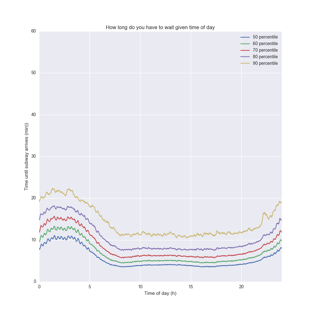
The 50 percentile line (blue) describes the median time you have to wait based on the time of day. The 90 percentile line (yellow) describes how long you have to wait if you are unlucky and a 90% event happens. It depends on your risk averseness what line you pick – if you have to make it to a flight you should probably pick the 90th percentile, but if it doesn’t matter if you are late, pick the 50th.
Not shockingly, the waiting times peak in the wee hours – in particular the 90th percentile shoots up around 4AM. The 7AM-7PM window is very stable, and then it shoots up again.
Waiting for subway and sunk cost
Let’s say you wait for the subway for 10 minutes and it hasn’t arrived yet. Should you give up? Probably not. But if you have waited for the subway for an hour, there’s probably no point. Up to a certain point waiting for the subway is an investment in getting home sooner.
It also depends on your risk averseness again – if you need to make it to a flight, you might just give up and get a cab at some point. So given that you spent $$ t $$ minutes so far waiting for the subway, what’s the additional time you’re going to have to wait?
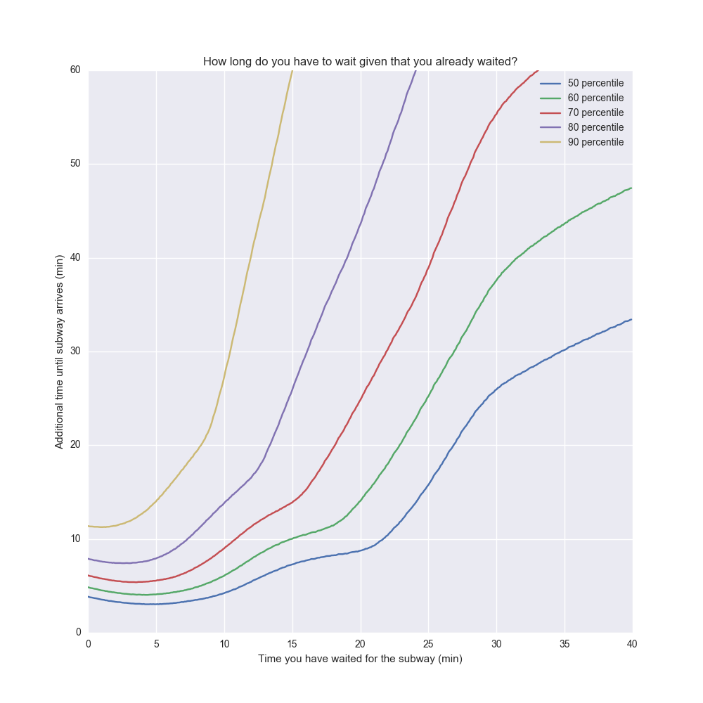
There’s a tricky bias here, because the times where you waited longer tends to skew towards nights. This would be a confounding factor. So I limited the data set to 7AM-7PM above.
The interesting conclusion is that after about five minutes, the longer you wait, the longer you will have to wait. If you waited for 15 min, the median additional waiting time is another 8 minutes. But 8 minutes later if the train still hasn’t come, the median additional waiting time is now another 12 minutes.
So when should you give up waiting? One way to think about it is how much time you think it’s worth waiting. The time you already waited is “sunk cost” so it doesn’t really matter. What matters is how much additional time you are willing to wait. Let’s assume you want to optimize for a wait time that’s less than 30 min in 90% of the cases. Then the max time you should wait is about 11 minutes until giving up (this is at the point where the yellow line cuts the 30 min mark).
This reminds me a bit of project management. The longer a project has been going on, the longer the expected value of additional time is. Whatever resources you spent is sunk cost but what matters is the most likely estimation of project completion going forward. But of course the more overdue a project is, the longer that estimate is.
Of course, there’s nothing “magic” about these kinds of distributions. There are certain probability distributions where waiting is an “investment” – the expected time until the next event goes down for every second you wait. There is exactly one type of probability distributions where waiting doesn’t affect the time until the next event at all. This is the exponential distribution and the particular property is referred to as memorylessness. Then, there’s “fat-tailed” distributions where the expected time to next event goes up for every second you wait. The NYC subway distribution exhibits all those behaviors in different parts of the curve.
All code is available here if you are curious!
(addendum: this post got some traction – see Reddit thread and Hacker News discussion)
Tagged with: popular, misc, math, statistics