Buffet lines are terrible, but let's try to improve them using computer simulations
My company has a buffet every Friday, and the lines grow to epic proportions when the food arrives. I've suspected for years that the “classic” buffet line system is a deeply flawed and inefficient method, and every time I'm stuck in the line has made me more convinced.
This is a hill I'm willing to die on, and it's also a place where I have a secret weapon: a well-executed computer simulation that solves this problem once and for all has an opportunity to unleash an 0.1% improvement in GDP. Consider all that time lost in lines! So I went to business. A few hours later (a bit too many hours!) I built a simulation framework for buffet lines.
Note: throughout the rest of the blog, there will be some huge animated gifs. Out of respect for your bandwidth, I have cut the gifs to be only 10s each, but there are also links to full 150s videos (mp4).
How do you simulate a buffet line?
I wrote a Python script to simulate buffet lines. The setup is pretty simple, although there's a lot of assumptions being made:
- There are 10 items on the buffet
- Any person wants a random 40% of those items
- Each person comes in from the left and exits to the right
- They take the food in order from left to right
- Each person walks according to a shortest path towards the next goal
- There is a rate (the “arrival rate”) by which new users enter on the left
“Classic” method
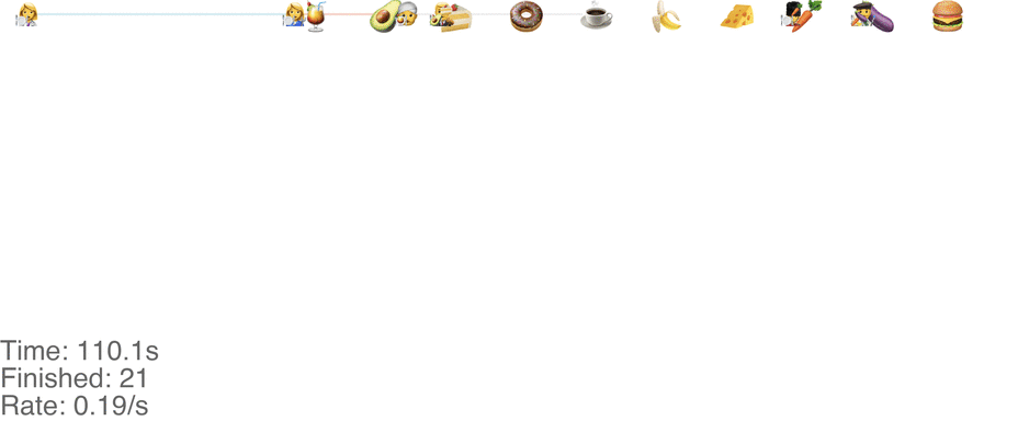
With the “classic” method, I'm referring to the single-line method where everyone is waiting in one big line that passes by all the items. This method works well at low arrival rates. For instance at 0.3 people per second, here's the state after 100 seconds (see full video here):
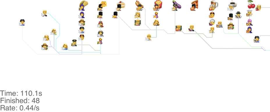
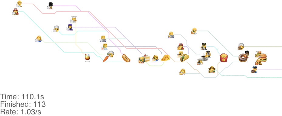
My simulation script produces these videos as a side effect: with random emojis for the food and people. I hope you enjoy it, because there will be a lot more! Focusing on the classic method for now: it turns out to be “unstable” as soon as the arrival rate goes up by just a little bit, in this case 0.7 people per second (see full video here):
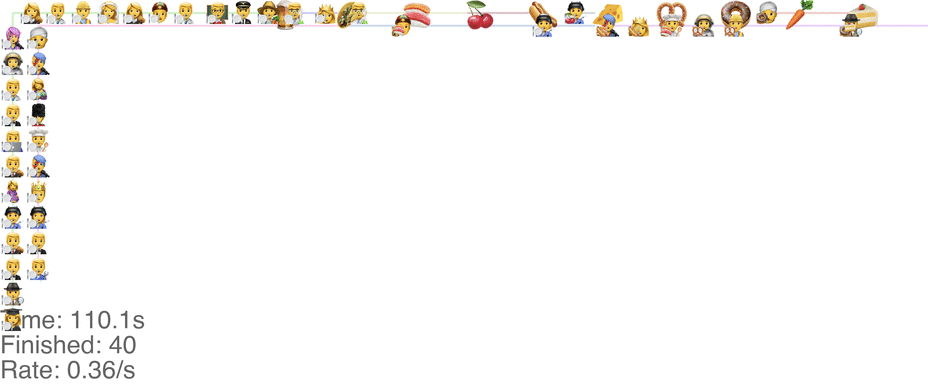
You can see the people accumulating on the far left side waiting for their turn. The line of people in fact just keeps growing and growing. It turns out that this method has a critical maximum capacity of something between 0.3 and 0.7 people per second. What do I mean with that? Every queue system has some upper capacity that determines the highest possible arrival rate. Above that, the queue keeps growing longer and longer because fundamentally the arrival rate is higher than the rate at which people are exiting the system.
There's no easy way to estimate the capacity of the system other than varying the arrival rate and seeing at what point the system breaks down. We do that by simulating the system at different rates. Let's consider some more methods next!
“Rogue” method
A marginally better model is to let everyone go in any direction they want, including skipping, but potentially also going back to the left. This method has a slightly higher capacity, but breaks down around an arrival rate of 0.7 people per second (see full video here):
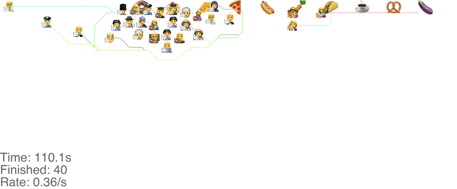
The lines in the video above is the shortest path towards the next food item each person wants, or to exit the system on the far right.
The problem is that people get “stuck”. Maybe this is a problem with the simulation, since my simulated puppets are dumb and won't consider the fact that they are blocking each other. The rogue method does in fact have a slightly higher capacity than the classic method, but with maybe other drawbacks (like getting elbowed by someone panicked, starved soul).
Let's consider to some slightly smarter methods.
“Don't go backwards” method
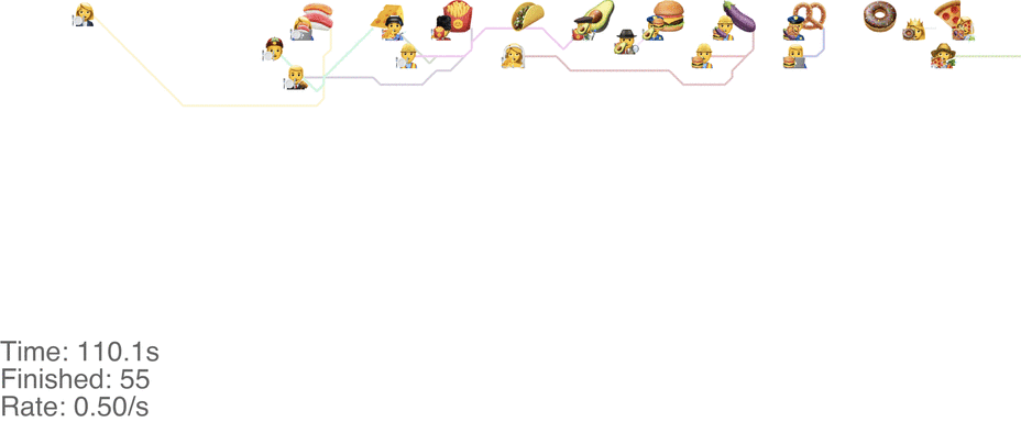
One maybe not obvious observation from the previous system is that the possibility of going backwards (to the left) causes these blockages. If we made it impossible to go backwards, then people would never go further right than their next food item. This would mean people getting the food are never blocked from going to their next item. This simple rule change turns out to increase the capacity of the buffet substantially, to somewhere around 1.0 arrivals per second (see full video here):
This method tends to cause a bit of an accumulation of people at the first food item, especially at a higher arrival rate: see video here. As the rate goes up even more, this jam because a complete gridlock: see a full video here.
In practice, this system is pretty intuitive. Just keep walking towards your next food item, and if you don't want a particular one, just skip it and walk around anyone in between. This basically avoids the “frustrating” points of the classic method, where you're blocked behind someone loading up on food that you don't even want, just because you want something later.
“Perpendicular lines” method
One method is to make the people line up in lines perpendicular to the food. This seems to handle up to roughly 1.0 arrivals per second (see full video here):
This system might seem very orderly, although a drawback is that the long perpendicular lines causes a lot of extra walking: this drives up the total time it takes for people to get food, meaning more people around at any point in time, causing delays for other people. For a video of what happens when the arrival rate goes up to 2.0, see here.
Which system is the most optimal?
Given the four methods I've just outlined, the question is: which one is the most efficient? For reasons I've alluded to above, it's not trivial to measure capacity by just simulating. But to spare you the ruminations, I'm jumping straight to the conclusion first. Which system is really the best? If my simulations are correct (a big if), the list looks as follows:
- “Don't go backwards” method (best)
- “Perpendicular lines” method
- “Rogue” method
- “Classic” method (worst)
Let's dig a bit deeper
Analyzing these methods is somewhat annoying tricky. We have a system with some arrival rate, each person spends some time in the system, and then exits. The (average) time it takes for a person to enter, get all its food, and exit, is called the “cycle time”. There is also an upper limit to the capacity of the method. As the arrival rate gets closer and closer to the capacity, the cycle time goes to infinity. When the arrival rate exceeds the capacity, more and more people accumulate indefinitely, with no end in sight.
I varied the arrival rates by increments of 0.05, from 0.05 to 2.0. If we vary the arrival rate and look at the number of people in the system over time for a particular method, it looks something like this:
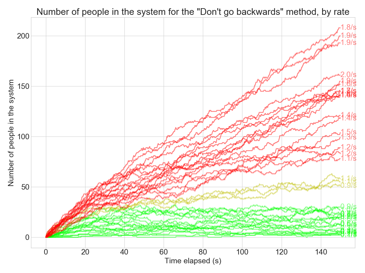
What are the colors here? I devised a hypothesis test to see if the queue is “stable” or growing over time. The red lines are the simulations where the arrival rate seems to exceed the capacity: the queue size grows indefinitely in those cases.
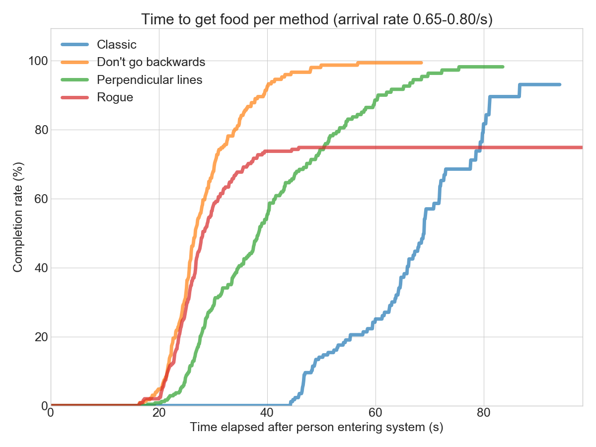
Another way to slice the data is to look at the distribution for the time it takes to “finish” for each person. I ended up using my own library convoys for this.
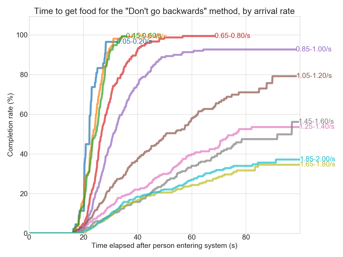
In the chart above, I grouped the arrival rates into slightly larger buckets so it's easier to follow. From both the charts above, we can see that the critical rate for this method seems to be around 0.8-1.0 arrivals per second. Below that, and everyone gets their food eventually. Above that, and the system turns into gridlock. From the cohort chart (the second one), you can see that less than 100% of the people that enter the system ever exit. Poor them!
Comparing all methods for a single rate shows that the “Rogue” method and the “Don't go backwards” are roughly similar up until ~0.6 arrivals per second:
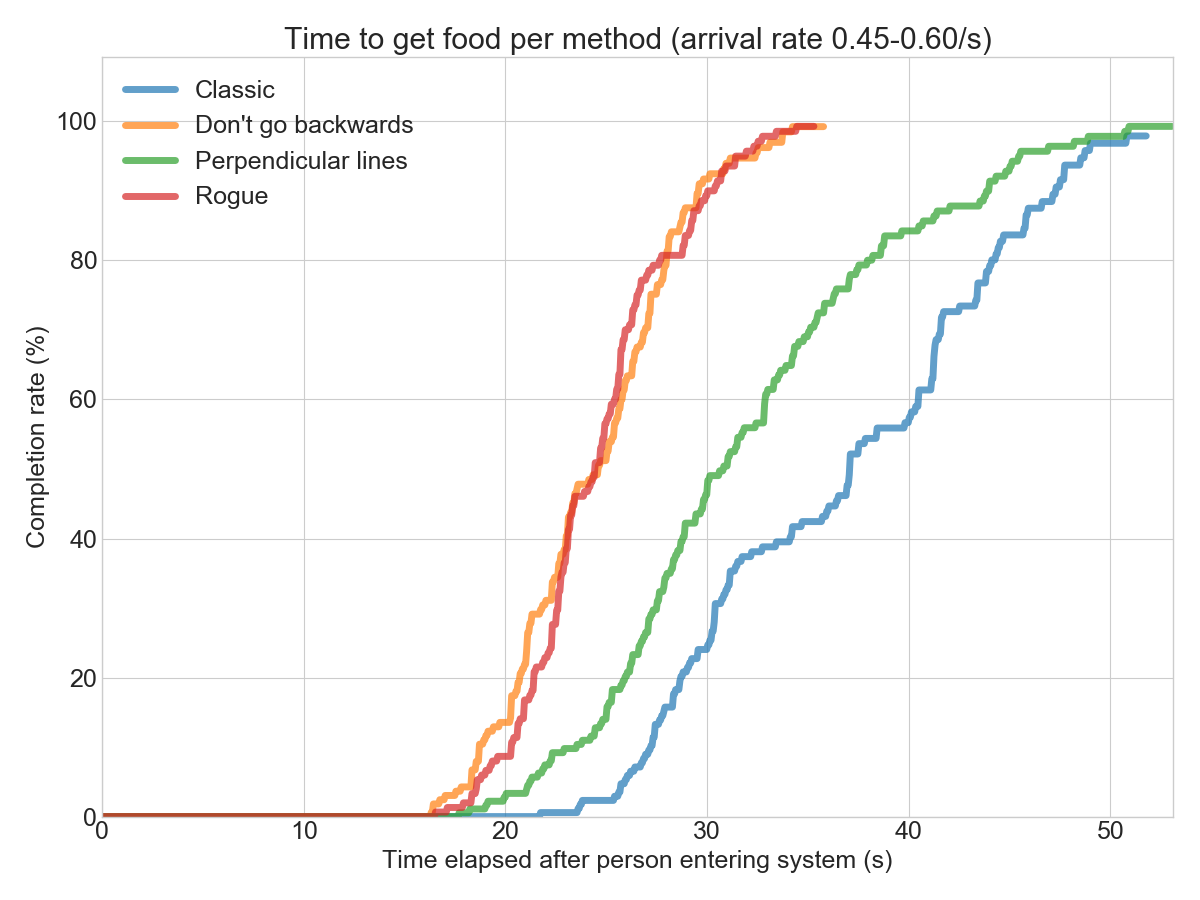
However, at 0.8 arrivals per second, the “Rogue” method breaks down into rubbish. The “Don't go backwards” method is still holding strong!
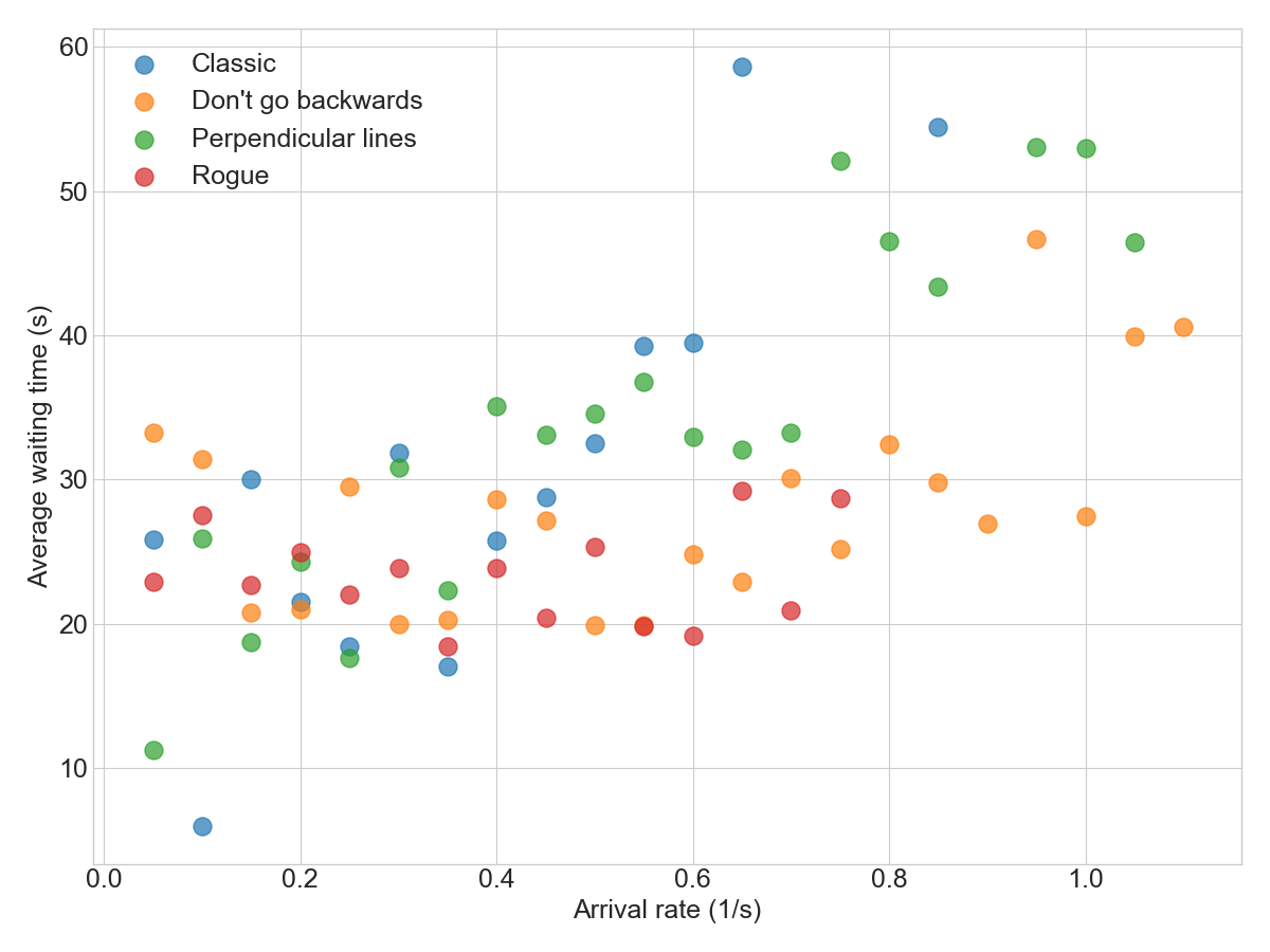
Comparing all simulations shows that the “Don't go backwards” method seems to work well for most arrival rates. In the chart below, that method is the most towards the lower right side, which is the best place to be (low cycle time despite a high arrival rate):
What else can we do?
Unrelated to the method itself, there are other things we can change to increase the throughput. Moving the food so that it's accessible from both sides increases throughput a ton. With the “Don't go backwards” method, this lets us handle an arrival rate of 1.5 people/s easily (see full video here):
There's more experiments that need to be run here: consider it the next frontier for buffet line research.
Notes
- If I had a million dollar grant, the next step would be to actually implement this with real humans and study their behavior. After all, this is more empirical research than it is theoretical.
- Writing the simulation in Python was probably a bad idea in retrospect: it turns out to be incredibly slow to run Dijkstra's shortest path algorithm on a large grid. Some simulations took more than a day to run (on a c2.8xlarge in AWS).
- A ton of time it took to implement the simulation had more to do with weird behaviors that would happen based on your assumption. For instance, I initially modeled people as circular, but they would get stuck in a “hexagonal” pattern. Changing them to be square resolved the issue.
- The hypothesis test I mentioned to see if the queue is “stable” is something I cooked up myself: draw samples from a Gamma-Poisson mixture and see if the imbalance between arrivals and exits is at least as extreme as what we observed. No idea if it's the best way but I really only use it to color lines in a graph so who cares.
- In order to determine the average latency in the scatter plot, I use Little's law and compute it from the average queue size and the arrival rate.
- The code is on Github, as always.