Conversion rates – you are (most likely) computing them wrong
How hard can it be to compute conversion rate? Take the total number of users that converted and divide them with the total number of users. Done. Except… it’s a lot more complicated when you have any sort of significant time lag.
Prelude – a story
Fresh out of school I joined Spotify as the first data analyst. One of my first projects was to understand conversion rates. Conversion rate from the free service to Premium is tricky because there’s a huge time lag. At that time, labels were highly skeptical that we would be able to convert many users, and this was a contentious source of disagreement. We had converted a really small fraction of our users, and we kept growing our free users like crazy. The conversion rates was standing still, if not going down.
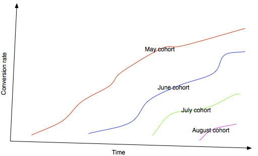
The “insight” I had was when I started breaking it up into cohorts. For instance, look at all users that joined on May 1 and track their conversion rate over time. The beautiful thing that happened was that the conversion rate keeps growing and growing over time. People converted at an almost uniform rate over the first few years. It was amazing to see. Some of the old cohorts that had used the service for 2+ years had some crazy high conversion rates, like 40-50%. This insight it implied that conversion rates wasn’t a big problem, and it was only becuase we were growing exponentially that the current conversion rate looked “artificially” low.
My lesson here is that conversion rates are sometimes pointless to try to quantify as a single number. Sometimes it’s a useful metric, but in many cases it’s not. Spotify’s conversion rate is not that useful to know in itself, since the user base is not in equilibrium. As long as the user base keeps growing, and as long as there’s a substantial lag until conversion, you really can’t say anything by trying to quantify it into a single number.
An example – exit rate for startups 2008-2015
Let’s go through an example of all the bad ways to look at conversion and then arrive at what I think of as the “best way” (in my humble correct opinion). Just for fun, I scraped a bunch of startup data from a well-known database of startups. Not going to get into all the gory details of the scraping, except that scraping is fun and if you do it too much your scraper gets banned… I probably could have used some lame boring data set, but data analysis is 38.1% more fun if you can relate to the data.
I have about 1,836 companies in the data set that were invested at some point, and 243 (13%) that exited at some point (either IPO or acquisition). So let’s for instance ask ourselves, how is the conversion rate going? Are newer companies exiting at a higher rate than older companies? Or is it getting harder over time to exit? The naïve way is to break it up by year founded and compute the conversion rates:
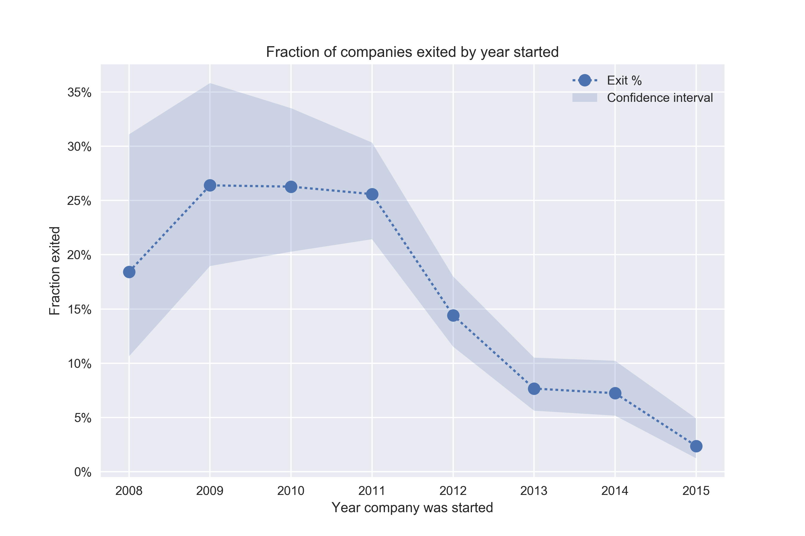
Except for 2008, it looks like the conversion rate is going down. Why? Is it harder and harder for companies to exit? Let’s look at the time to exit as well.
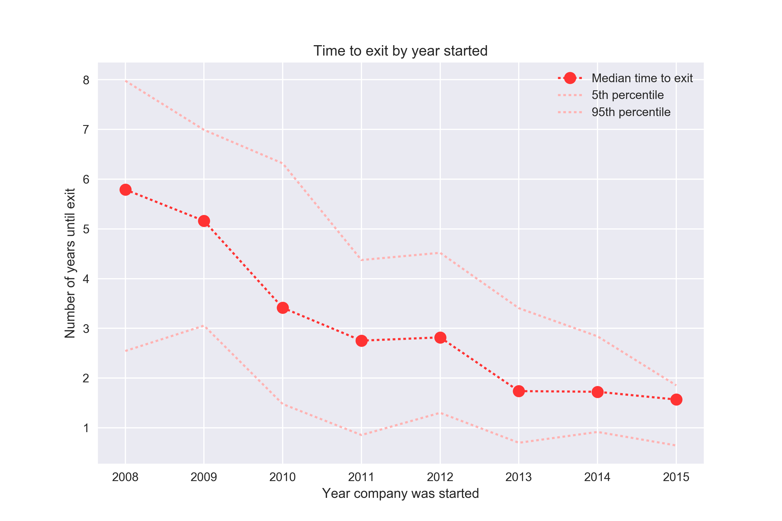
Here we see the opposite trend of what we saw in the previous chart – it seems like it’s getting easier and easier for companies to exit!
So what’s going on? If you think about it for a bit it’s pretty clear – we are mixing data from 2008 (where the companies have had 9 years to convert) with data from 2016 (where companies have had a year or less). We don’t know what companies from the 2016 group that will convert in the future.
Both of these charts underlines that there’s often no such thing as a single “conversion rate” and no such thing as a “time to conversion”. In the case where conversion has some clear upper time limit, you might get away talking about those metrics. For instance, it’s probably fine to measure landing page conversion rate by looking at how many people clicked a link within an hour. But in many cases, including the case of startup exits, as well as Spotify free to Premium, “conversion rate” and “time to conversion” is nonsensical and cannot be defined.
The right way to look at conversion rates – cohort plots
To compare conversion rates, it makes a lot more sense to compare the at time T, where T is some time lag such as 7 days or 30 days or 1 year or whatever. For instance in order to compare the conversion rates for the companies in the 2012 and 2014 cohort, compare what percentage of them has converted within 24 months.
We extend this to all times T, and plot it as a function of T. Does it take longer to exit for startups that started in 2014 compared to 2008? Let’s take a look:

I’m not sure what’s the “official name” of a plot like this, but generally people refer to it as a cohort plot. For every cohort, we look at the conversion rate at time T. Note that since we don’t know anything about the future, we can’t say much about the 2016 cohort beyond ~5 months – it includes some companies started in Dec 2016 so we simply don’t have full data after 5 months. This is all great and checks a lot of boxes:
- We can compare conversion rates for different cohorts and understand if it’s getting better or worse ✅
- We can see if certain cohorts convert faster ✅
I generally think of this approach as “as good as it gets” in most situations. Except my only issue with it is that the idea of measuring “conversion at time T” means we can’t use too much recent data. For instance, it would be much better if we could look at 2017 data and see how well it’s converting? I like metrics to have fast feedback loops so surely we can do better? Turns out we can.
The 😎 way to look at conversion rates – Kaplan-Meier
Kaplan-Meier is a non-parametric estimator originally used to estimate the survival function. Turns out the survival function is 1 minus the conversion rate, so it’s the exact same thing essentially. Non-parameteric is good if you have no idea what the underlying distribution you are modeling is.
The best part of the Kaplan-Meier is that it lets us include data for which we simply haven’t observed anything past a certain point. This is best illustrated if we broaden each cohort a bit so that they contain a larger span. Let’s say we’re trying to understand the conversion rate of the 2008-2011 cohort vs the conversion rate of the 2012-2015 cohort. The hypothesis would be that we want to understand how the exit rate has changed over time:
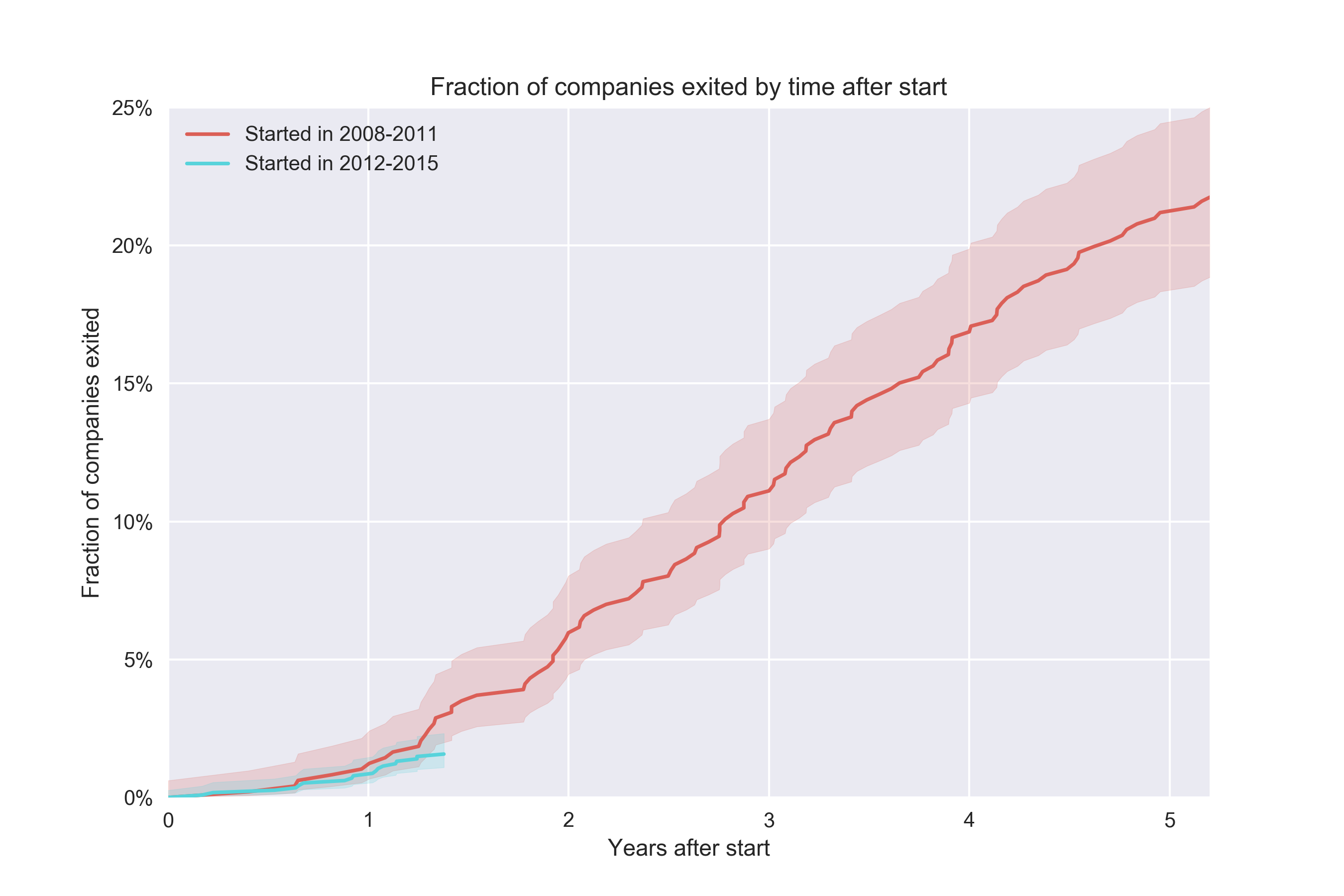
This is a super simple plot to draw except for the confidence interval. Just literally divide the number of exited companies by the total number of companies to get a rate.
The problem here is that we can’t say anything about the second cohort beyond ~1.5 years because that would require saying something about future data. This cohort contains companies up to and including Dec 31, 2015, which have had slightly less than 18 months of history to convert. On the other hand, the oldest companies in this cohort are from Jan 2012, so they have had a lot of time to convert. Surely we should be able to plot something more for this cohort. The Kaplan-Meier estimator lets us work with this issue by being smart with how it treats “future” data for different observations (“censored” observations, as it’s called in survival analysis lingo):
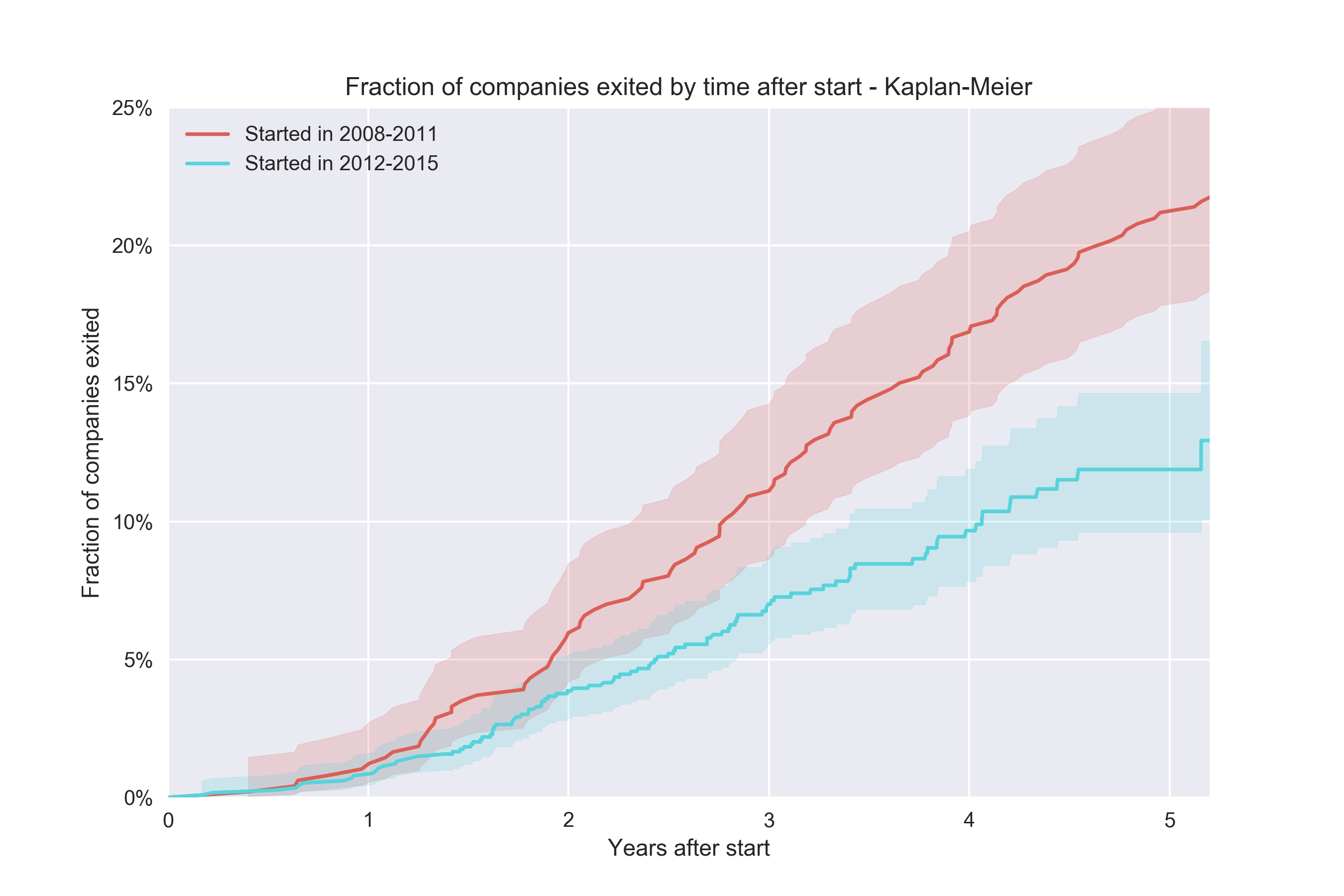
The implementation is absolutely trivial, although I used the lifelines packages in Python to get this and we also get a snazzy confidence interval for free (this is a bit harder to do). So the conclusion here is that yes – it seems like newer companies don’t convert at the same rate as older.
If you want to implement Kaplan-Meier yourself, the idea is basically to compute a conversion “survival rate”. If we start out with 100 items and one of them convert at time 1, the survival rate is 99%. We keep computing those rates and multiply them together. When data is “censored”, we just remove from the denominator:
n, k = len(te), 0
ts, ys = [], []
p = 1.0
for t, e in te:
    if e:
        # whether the event was "observed" (converted)
	# not observed means they may still convert in the future
        p *= (n-1) / n
    n -= 1
    ts.append(t)
    ys.append(100. * (1-p))
pyplot.plot(ts, ys, 'b')
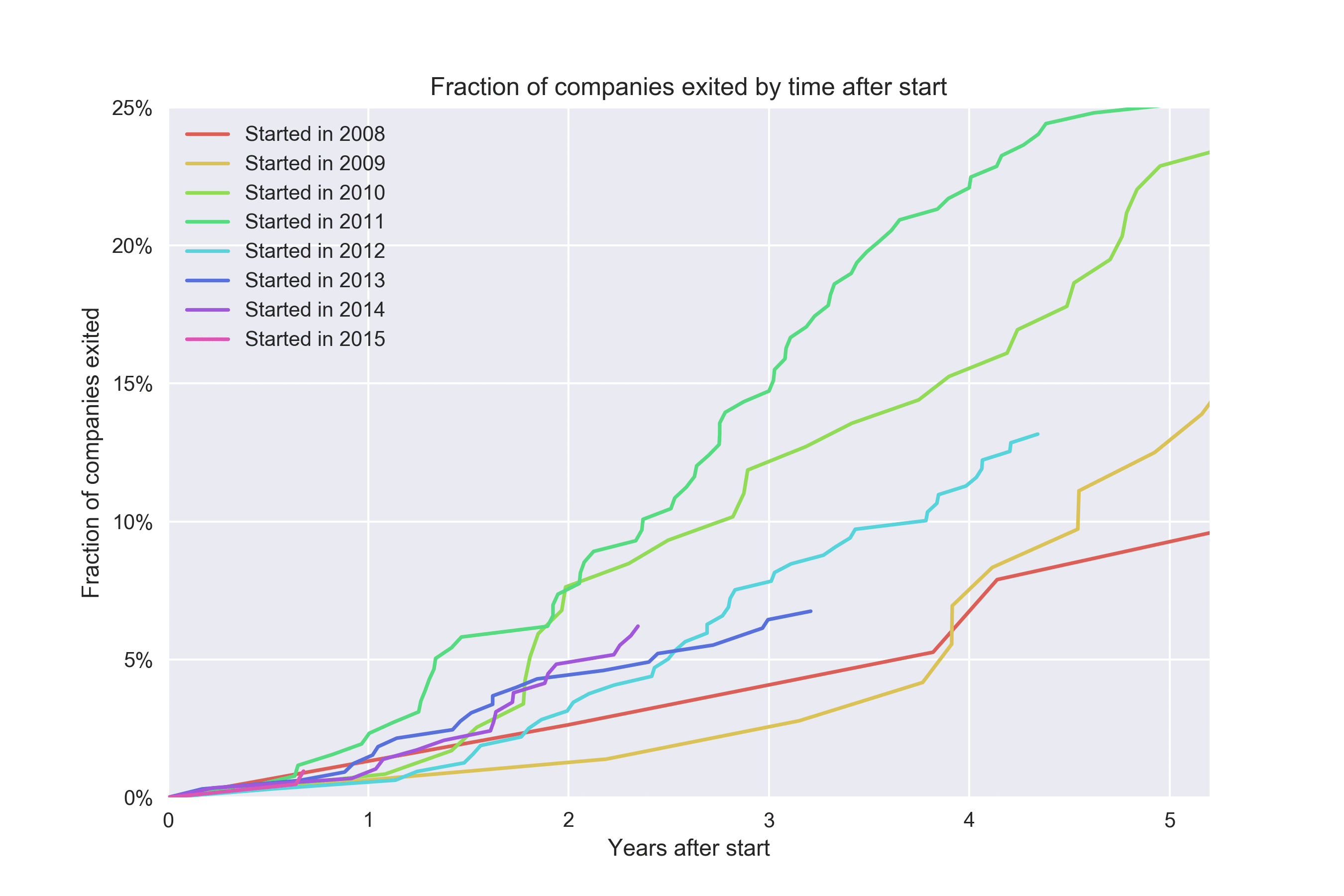
Kaplan-Meier lets us get a bit more out of each cohort. Look at what happens if we plot one cohort for each year:
Epilogue
In a previous post, I built a tool to analyze the survival of code. Given that it’s obviously survival analysis, I went back and updated the tool tool to plot survival rates (of code) using Kaplan-Meier since it was such a tiny diff. Here’s the survival curve of individual lines of code of Git itself:
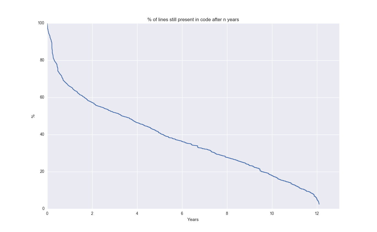
Cool to see that a few lines of code are still present after 12 years!
Conclusion
When people talk about conversion, and if there’s time lag involved, remember: it’s complicated!
EDIT(2019-09-26): check out a kind-of v2 to this blog post: how to use Weibull and gamma distributions to model conversion rates.
Notes
- A fantastic blog post talks about churn prediction from a machine learning perspective. Much more math focused than this posts. From the post: The hacky way that i bet 99.9% of all churn-models use is to do a binary workaround using fixed windows (referring to “conversion at time T” as the target variable).
- In the plots that are not using Kaplan-Meier, we can compute the confidence intervals using
scipy.stats.beta.ppf([0.05, 0.95], k+1, n-k+1)). Generally good to visualize the uncertainty. - I mentioned that non-parametric methods are generally good. To be clear, they can be bad because they don’t let you impose priors and other things that can sometimes let you regularize the model.
- On that topic, I actually found an interesting Bayesian survival analysis using PyMC3 that looks cool. Haven’t had the energy/time to fully comprehend it.
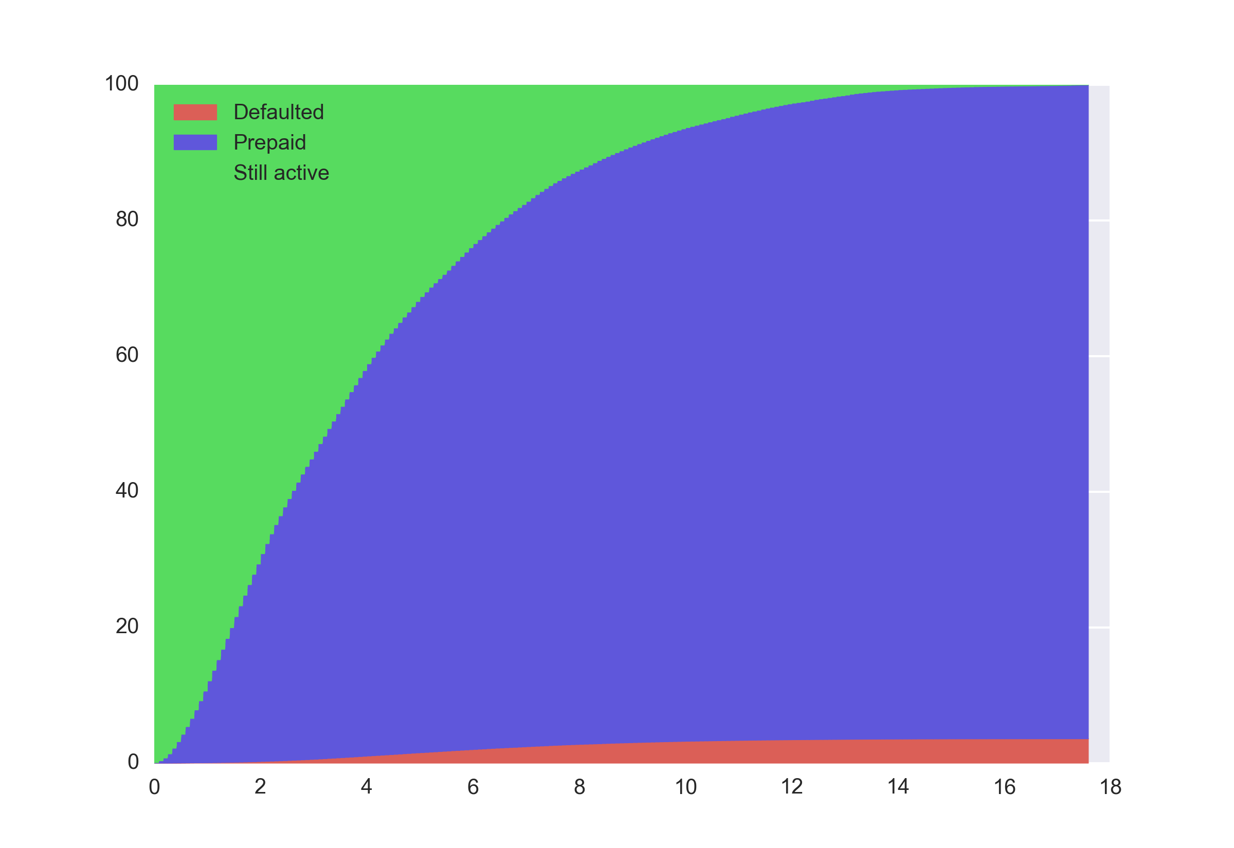
- I also wanted to point out there are situations where Kaplan-Meier doesn’t work. As soon as we’re dealing with anything more complicated than a conversion rate (from state X to state Y) then it breaks down.
- For instance, let’s analyze the Freddie loan level dataset to understand the state of mortgages. At some point in time, a borrower can prepay or default. And for a lot of the more recent observations we don’t have enough history to determine the final outcome. Since we have two different end states (defaulting or prepayment) we have to resort to something else. The simplest way is to just compute the normalized share over all the observations that are still active at time T:
- As usual, the code is on Github